
Dynatrace Blog
Modern cloud done right. Innovate faster and compete more effectively in the digital age.

Dynatrace news
Beyond uptime: Unveiling the improved Dynatrace SLA
Simplified image management: Dive into our end-to-end Harbor and Jenkins integration
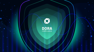
The Dynatrace journey toward DORA compliance

Dynatrace completed Data Privacy Framework self-certification

Generative AI poised to have impact by automating software development, report says